An interface is not just a collection of buttons and icons, but a window through which people interact with the products of the digital world. It plays a significant role in forming first impressions, determining the usability of software, and influencing user actions.
In this article, we will look at the key features of a comprehensible user interface (UI) in programs for writing documentation and list the most common mistakes when creating it. But first let's define: what is called a clear interface?
What is a “clear interface” in programs for creating user documentation?
A clear user interface is often referred to as a “user-friendly” interface. Among the first to use the term extensively back in the 1960s was programmer Harlan Crowder of IBM. At that time, computers used punched cards, and being user-friendly meant being easy to use equipment that had intuitive controls that were accessible to anyone.
Even earlier in the 30s, industrial designers such as Henry Dreyfuss began to realize that things should not only be beautiful and easy to maintain, but also easy to understand how to use. However, the greatest influence on the development of the idea was a serious accident at a nuclear power plant in 1979 and the deaths of dozens of pilots during World War II.
In the case of the power plant, the operators had no feedback on what was happening. For example, they pressed a button to open a valve, but received no confirmation that it had actually opened. Simply put, the equipment interface was not responsive.
As for the pilots, they were making mistakes because the control panel was poorly designed. In other words, the interface lacked a clear and logical structure.
The technicians at the time blamed human error, and the real problem was bad design. Over time, it became clear that it made sense to design interfaces to fit human thinking, rather than forcing users' thinking to be tailored to the interface.
These days, an understandable UI is crucial when creating digital products, whether it's a mobile app, a commercial website, or online help for users. An important aspect of a user-friendly UI is the use of metaphors, which will be discussed next. A good example of a metaphor is the desktop with its folders and trash can.
So, a user-friendly interface is user-centered. It requires no extra effort for you to understand how to interact with it. It is intuitive, logical, and allows you to accomplish your goals quickly.
For example, you run a technical writing program and you understand in a flash how to create a section, where the text editing tools are, how to undo an action or add a comment. You realized this because you saw the corresponding icons. They accurately convey the meaning of their purpose and have tooltips.

In the clear interface you could find them quickly, because they are exactly where you expect to find them, this knowledge is based on your experience in other programs. Just as importantly, you didn't have to search for them in a bunch of other elements, because only the essentials you need to get started are in the foreground.
As an example of intuitive elements used in technical documentation writing programs, we can name the anchor icon. The user immediately realizes that the button with this icon creates anchor links. The arrow next to the name of the topic in the project tree indicates the presence of child topics in it. The gear is standardly responsible for calling the settings window, the button with a question mark calls the help window.
Fact
Companies that incorporate design best practices into user interfaces grow twice as fast (according to toptal.com statistics).
In an effort to simplify the process of creating user documentation, UI designers often move elements fr om drop-down lists, tabs, and menus directly to the main toolbar. But by doing so, they achieve the opposite effect.
The user gets confused by all these buttons and windows and has to spend time studying the functionality intended by the developers.
With a proper approach to interface design, users can interact with the program without prior explanation, and the introduction to additional tools is gradual. The user will move to them after learning the basic ways of control. For this purpose, the basic functionality should be placed on the first level of the interface, and the rest of the functionality should be located at a “distance” of no more than two or three clicks.
An example of Tesla's minimalistic functional technical documentation:
Let's take a look at the non-obvious features and attributes of a clear interface.
Key features of a clear interface
Simplicity and minimalism
Practice shows that the fewer elements on the screen, the fewer distractions and easier it is for the user to focus on the task at hand. If you can't reduce the number of elements on the screen at the same time, divide them into logical groups.
Use empty space. This includes paragraph borders and line spacing. Many people mistakenly believe that emptiness is a waste of screen space, but it helps to visually delineate elements and improve readability.
It becomes easier to understand which details are major and which are minor. In the following example, we see balanced use of space.
Mailchimp service in its technical documentation for designers does not hesitate to give more than half of the screen for white space:
There are three tools that can help you keep things simple and minimalistic with color while creating a clear hierarchy: hue, saturation, and brightness. But it is important not to overdo it, otherwise the user will think that everything is important and there is no hierarchy in this interface.
Fact
80% of people are willing to pay more for a better user experience (study of uxplanet.org).
Intuitive design
Use the metaphors we have mentioned above. They allow you to link abstract ideas to concrete images that users are familiar with. For example, icons are tiny clues that help users quickly understand what this or that element does. A button with a floppy disk — saves content, a button with a magnifying glass — for searching.
The example below demonstrates that even without explanatory text, you can get an idea of the controls' functions:

Recommendations for using metaphors in Shopify service documentation:
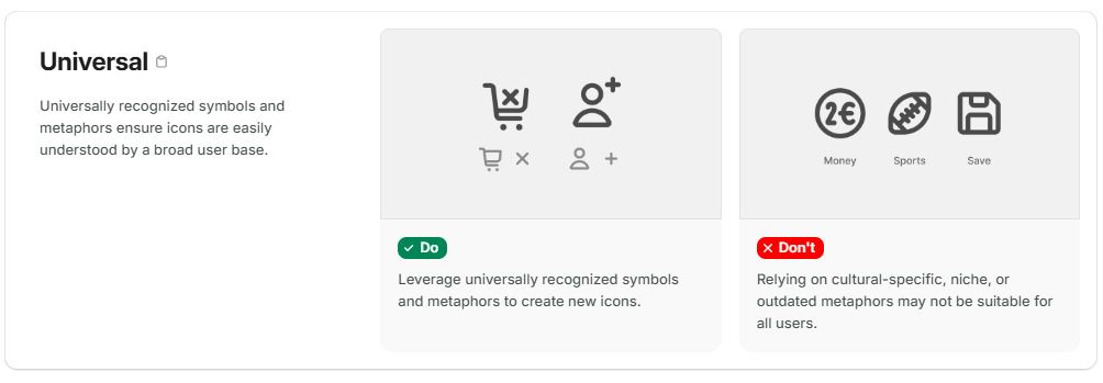
The interface should match what the users expect to see and how they intend to interact with the product. When users start a program, they look for familiar elements and intuitive interactions, and if they find them, they immediately understand how to write technical documentation, for example how to create a new topic in a document or how to export documentation to HTML. Deviations fr om familiar patterns cause people to spend time trying to make sense of unfamiliar concepts or graphical metaphors.
For example, IBM's Carbon design system offers a template where users can easily find certain types of content in familiar areas:
- header.
- global side navigation.
- local side navigation.
Logic
A logical interface is predictable, consistent and conforms to users' natural mental models, i.e. the way people think and perceive information. For example, a signup form should begin with entering a name and email, rather than selecting a subject color.
Logic includes consistency, wh ere interface elements look and behave the same in all contexts, and predictability, wh ere users know exactly what will happen as a result of their actions.
In the context of this topic, the content and layout of the documentation must be logical, otherwise users will not be able to navigate through the numerous topics and subtopics.
A clear hierarchy helps to quickly navigate through the content. Otherwise, clutter arises, requiring more effort to navigate. Use elements of different sizes: the more important the information, the larger its size. Within reasonable limits, of course. Equally important is color. In some cases, the most saturated hue is a signal that you can interact with this element, i.e. you can get a feedback from the system.
An example of a logical structure of the tree of topics in the technical documentation of the Elastic service:
Consistency
Consistency means that all elements of the interface — buttons, icons, fonts, colors, arrangement of elements — are subject to the same visual and functional style. This creates a sense of integrity and orderliness, which makes the interface more understandable and memorable.
Part of consistency is the characteristic of permanence: the same elements should always perform the same functions. For example, the “Save” button should always save data, not close the program after saving or redirect to the main page of the site.
Example of technical documentation design for Audi designers. The rounded font design harmoniously echoes the company logo. Nothing superfluous:
There are several main aspects of consistency:
- Visual consistency implies a uniform design style, uniform color palette, typography, and icons. This creates a harmonious perception of the interface.
- Functional consistency: the same elements perform the same functions in different parts of UI.
- Behavioral consistency: interface elements behave predictably. For example, when you put the cursor over a link, it is always highlighted.
Fact
45% of companies do not test their product interfaces (according to statistics of econsultancy.com).
Feedback
Feedback in the context of a user interface is the system's response to a user's actions, helping the user to understand that their action has been performed. It can be a visual change (such as a button changing color when the cursor is hovered over or a loading indicator that shows that the system is processing a request), an audible notification (such as a click when a button is pressed), or a tactile feedback (such as a vibration when a smartphone screen is tapped).
The user should understand what is happening in the system and how long to wait for a result.
Accessibility
Accessibility is the ability of a product or service to be used by all users without exception. It includes not only the ability of interfaces to be used by people with disabilities, but also takes into account different cultures, age groups and other factors that affect the perception of information.
The interface should be accessible in a variety of ways. For example, information should be presented visually, auditorily and tactilely. Ideally, information should be equally accessible to users of different ages, with different user experience and with different technical background. This applies to the text itself as well as the UI.
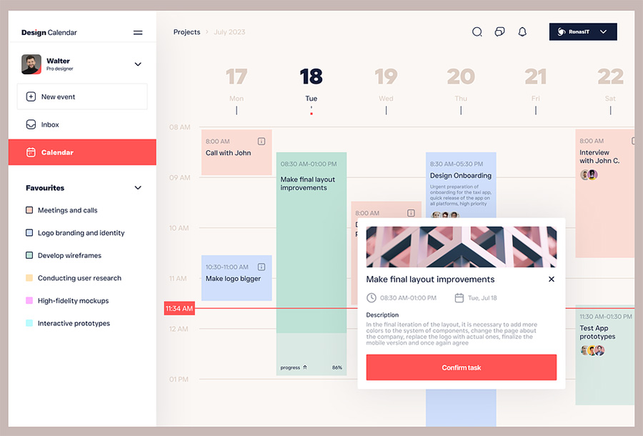
A good interface should adapt to different screen sizes and input devices.
Fact
In Amazon's first year, Jeff Bezos invested 100 times more in customer experience research than in advertising.
Common mistakes when creating an interface
One of the biggest mistakes is that designers and developers create an interface based solely on their own preferences and ideas of what it should be. They forget about studying the real needs of the target audience. A product may look beautiful, but if users do not understand how to work with it, they will quickly lose interest.
High cognitive load
Interfaces that are overloaded with controls, text boxes and visuals can be confusing and make it difficult to accomplish basic tasks. It is important to remember that each element should have a purpose and value to the user.
The interface of the documentation writing service Paligo is free of visual garbage, at the same time it offers all the functionality you need without having to search for it in the wilds of tabs:

Lack of feedback
Users should get feedback after every interaction with the interface. This helps them understand what is happening with the system and what actions were performed successfully or unsuccessfully.
For example, lack of form submission confirmation, long wait for a page to load without a progress bar are signs of a bad UI.
Lack of clear structure
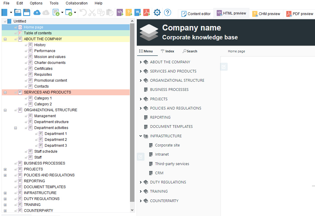
The typical structure of technical documentation is characterized by a strict hierarchy, and the user understands intuitively in which section this or that information is located. This approach is desirable when creating any content, not only when writing user manuals and knowledge bases.
An example of a template with well-organized documentation structure in the Dr.Explain interface:
Poor text readability
Well-readable text is not only important on physical media, its design should be maximized in applications as well. Mistakes in font, size or color can make text difficult to read, negatively impacting the user experience.
How do you put logical and predictable interfaces into practice? Without recounting the numerous literature written on the subject, in a few words: design based not on your experience, but on user experience.
Fact
After redesigning its platform, Virgin America reduced customer service calls by 14%.
Examples of clear interfaces
It makes sense to take an example from well-known companies that invest heavily in studying interfaces and user reactions. These are ready examples of how to competently design a program. Let's see what we can learn from the leaders of industry.
The strict unobtrusive interface of Vectorworks's user documentation has neutral colors, so that screenshots of the program with contrasting details (faces, edges, dimensional containers) are not lost against their background:
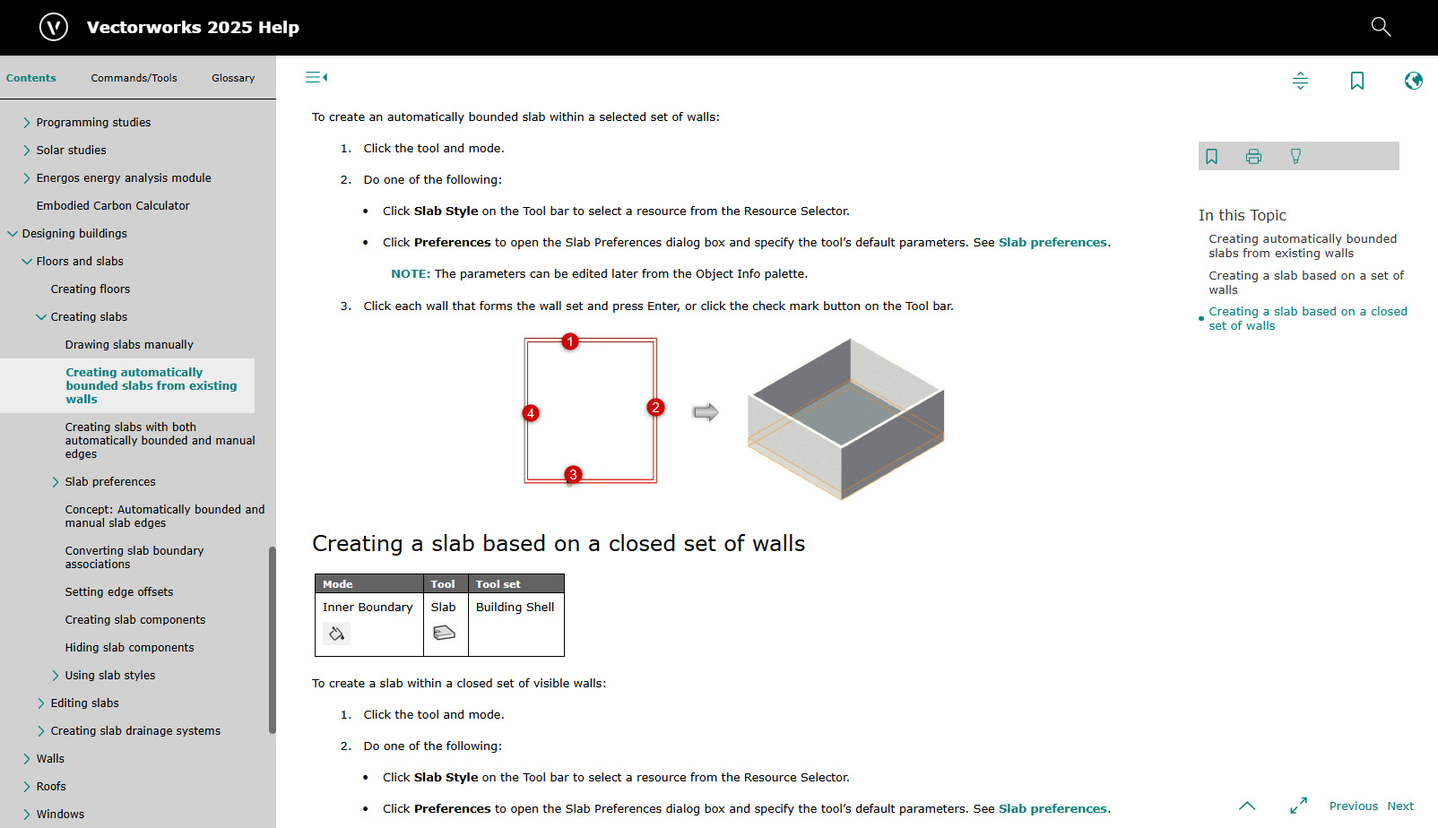
Visibility is important in documentation. Dell, for example, adds annotated screenshots to the text:
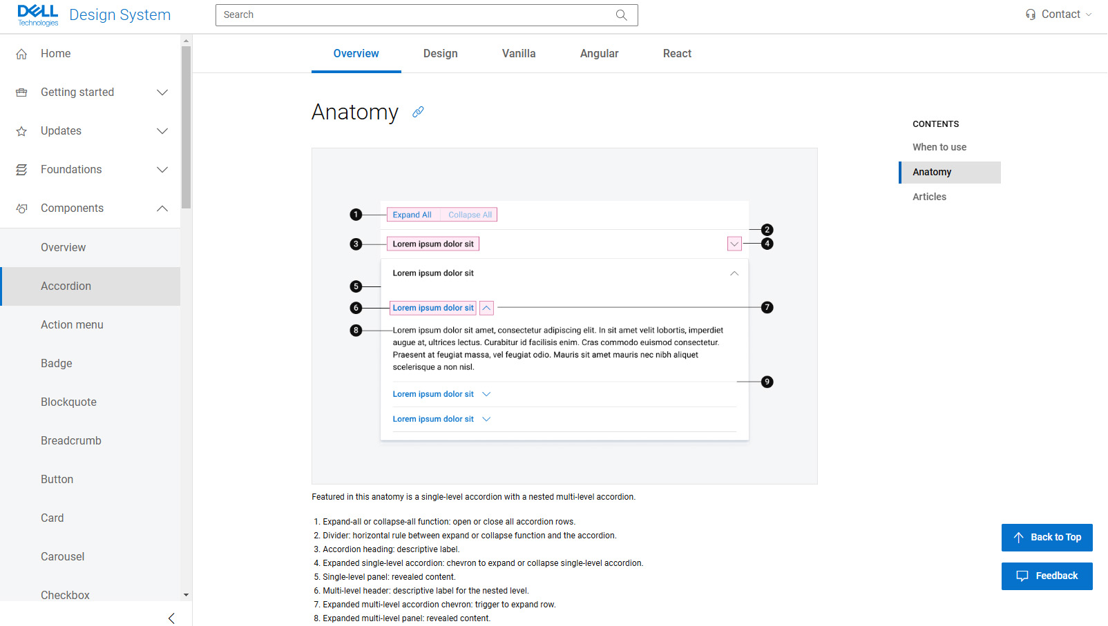
And Boston Dynamics makes extensive use not only of conventional images and diagrams, but also of video:
An example of a General Electric technical documentation page. Even without button labels, we realize that in the Layout topic we can switch between templates for desktop and mobile applications using buttons with corresponding icons. The same can be said about the buttons for selecting light and dark themes:
Maximum concise design of content in Samsung documentation. Already at the first glance without reading the document you understand what design requirements this company has:
Porsche uses the Porsche Next typeface, created by renowned designer Kurt Weideman. The fonts of the Next family are designed at the intersection of two typographic archetypes: constructivism and humanism. In this case, the typography emphasizes the philosophy of the brand.
Conclusion
A clear interface is not just an aesthetic element, it is the key to the success of any digital product. Investing in a user-friendly and intuitive interface pays off by increasing user satisfaction.
User-friendly interfaces in technical documentation play a key role in the effective communication of information. It provides easy perception of the material, reduces the time to search for the necessary data and minimizes the number of errors when performing actions.
We, the developers of Dr.Explain technical documentation writing software, understand the importance of UI in help systems, that's why we pay attention to user experience research when designing software and work a lot with customer feedback. We believe that not only the interface of our product should meet user expectations, but the work as a whole should be oriented towards customer needs. The best result starts with a clear understanding of user needs, not with the desire to create an innovative interface. This is the only way to create a product that has remained an indispensable tool for professionals around the world for 20 years.

