


Create online manuals
Creating online manual is one of today's most popular documentation formats. With the professional help authoring tool you can turn your project into a set of HTML files ready to upload to your server. No programming required.

Publish your user guide online, and potential customers can explore your software's features before they even download it. A well-crafted online guide builds trust with prospects and can improve your site's search engine rankings.
How do I create an online guide in Dr.Explain?
You don't need to know HTML or CSS to publish online help. Simply create a project in the main menu and outline the topics of your future online guide. If you prefer not to design the structure yourself, you can use one of the ready-made user guide templates.

Add your content — text and images that describe your software’s features — using Dr.Explain’s editor and its automatic annotation tools. Customize your guide’s style without leaving the application. Choose from pre-built themes or create your own using CSS. You can also fine‑tune the look of your online guide directly in the preview mode.

A web-based guide should include a table of contents for quick navigation, with each page focusing on a specific topic and linking to related topics. It also comes with built-in navigation features like Next, Previous, and index links. When your guide is ready, simply export it and upload it to your server. Dr.Explain handles these final steps effortlessly.

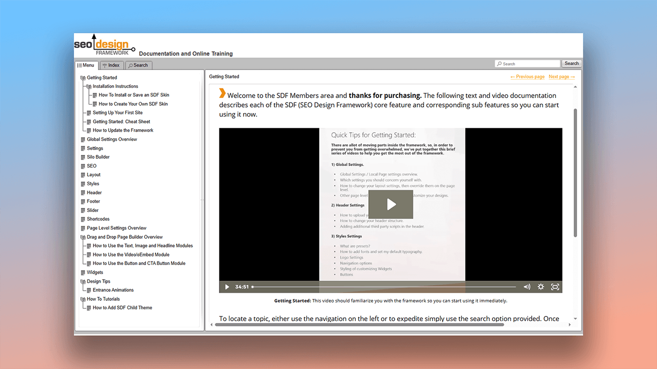
See how easy it is to create custom online documentation in our video.

Examples of online manuals created in Dr.Explain
Our success stories page features real-world examples of user manuals and use cases of how Dr.Explain has helped businesses solve their documentation challenges. You can also see examples of web-based help guides built with the application.


What are the benefits of using Dr.Explain?
The examples above show just a few of the possible design styles. Without writing a single line of code, you can implement a wide variety of design solutions for your online guide. Dr.Explain also provides:
Responsive design. Create online help that automatically adapts to mobile devices — no coding needed.
Web analytics integration. Add tracking to gather usage statistics, helping you identify the strong and weak parts of your documentation for further optimization.
Third-party code support. Embed widgets and other elements to make your user guides more visual and interactive.
Cloud service vs. Dr.Explain: a comparison
Many teams use cloud-based (SaaS) platforms to write documentation. These services offer clear benefits like accessibility from anywhere, built-in version control, and cross-platform support. However, desktop applications like Dr.Explain remain highly relevant. Here’s how they compare when creating online help guides:
| SaaS-platform | Dr.Explain desktop application | |
|---|---|---|
| Offline functionality | — | + |
| Data security | It may go beyond the user's control. It depends on the provider, on the browser, on the security policy and data protection of the cloud service. | It is under the user's control. |
| Efficiency | Depends on the internet connection. | Depends on the performance of the PC. |
| Automating screenshot annotation | Depends on the service, it may be limited | + |
| Output formats | Online manuals, sometimes PDF. | HTML, CHM, DOCX, PDF. |
In certain situations, the features of cloud platforms can be seen as advantages. The choice between a SaaS solution and a desktop PC application ultimately comes down to your specific requirements for security, accessibility, and data control.
What type of users is Dr.Explain suited for?
Dr.Explain is a versatile tool, suitable for creating user documentation in any field. It’s definitely worth trying if you need:
- a powerful performer that handles documents of any size smoothly;
- easy-to-use navigation through your project;
- full-featured search;
- flexible design tools to customize the look of your documentation;
- straightforward multi-format export;
- collaboration features for team projects;
- a reliable on-premises solution (desktop software).
Users about creating online guides in Dr.Explain

"Dr.Explain works excellently, and we have already converted our big online help project to its format".
Jim, CNCSimulator Company
Interview with Jim

"I find that Dr.Explain works better for our industry sector and provides the “book feel” in an online format, which seems to work well for our customers who are not technical".
Darryl Winder, managing director and co-owner of the SmartFees project
Interview with Darryl

"The option to easily publish our docs online is also very useful for us. We build both a static version of the docs which follows the software installation and an online version which is always up-to-date with the latest changes".
Are Tømmerås, Senior Geologist at Migris
Interview with Are
Frequently Asked Questions
Will the online guide be optimized for mobile devices?
Yes. The documentation is automatically built to be responsive and will display correctly on phones and tablets right from the start..
Do I need any technical skills to create a web guide?
No. Just write your content like any other document — Dr.Explain automatically turns it into web-ready HTML user guide, ready to publish online..
What is the HTML format?
HTML is the standard format for creating web pages. When you export user manual to HTML, you'll get a complete online user guide ready to publish..